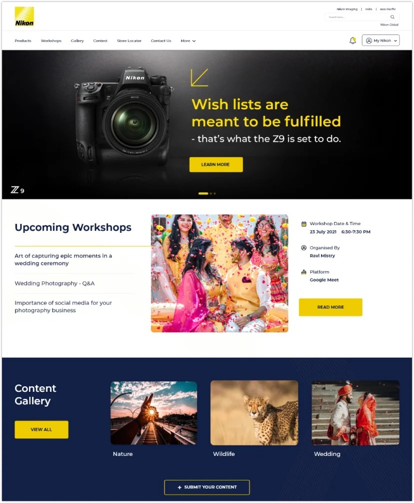
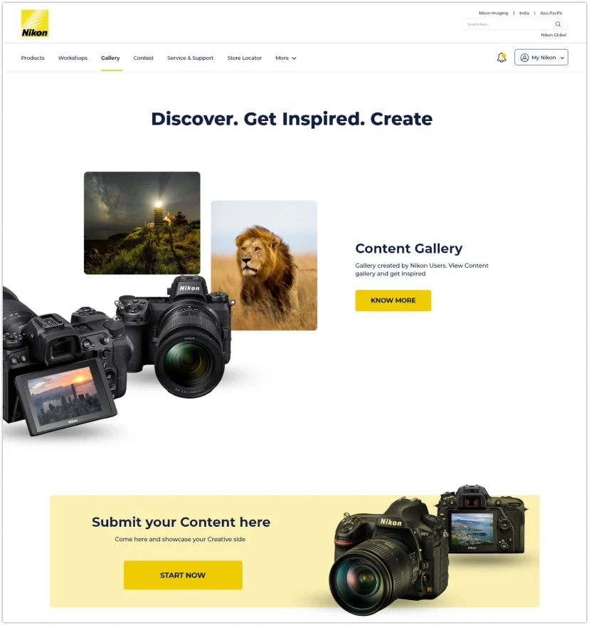
nikon thumb

My Nikon:
Engage, Educate, Empower

A key technology solutions company in a global society where humans and machines co-create seamlessly

Consumer Durable

Industry

Responsive Web

Platform

UI/UX Design

Services
nikon
playIcon

Overview

In today's digital age, where customer experience drives brand loyalty, Nikon, a leader in photography, launched the "MY Nikon" project to transform its digital presence. This initiative aimed to create an engaging platform for both new and existing users, offering product discovery, after-sales support, workshops, loyalty programs, and community engagement.

More than just an app or website, the project envisioned a complete digital ecosystem that reflects Nikon’s brand and serves its global audience.

Challenges

The redesign initiative began with the development of a concise design guide. The guide focused on streamlining the color palette to include a mix of Light (#E8F1F4), Dark Blue (#0D1A28), Accent Yellow (#F7FC00), and other complementary colors, ensuring a cohesive and modern aesthetic across the website. The typography was standardized around the Inter and Gilroy font families, chosen for their readability and contemporary feel. An extensive icon library was also created, aimed at enhancing the visual communication of Learning Point’s My Nikon offerings.

Outcome

The final website offers an improved user experience with its user-friendly design and a strong focus on addressing users' real needs. It also reduces the cognitive load on users as they explore information, helping to keep their attention.

about project

Our Process

Discovery

A Deep Dive into Vision and Goals

Launching each project with meticulous precision, ensuring every element performs as planned.

Wireframe Kits

Wireframes and UI Kit Design

We continuously analyze performance data post launch, applying adjustment to optimize outcomes in real-time.

Ux Laws

Using Psychology to Design Better Products & Services

Evaluating and refining UX to ensure peak usability and stisfaction.

Design

Turning Research Insights into User-Friendly Features

Designing intuitive interfaces for complex AI technologies, enhancing usability and engagement.

How we
Started

With a clear goal in mind, we conducted a competitor analysis to identify common requirements among different learning platforms and explore various learning methods.

Our step-by-step process

  • Testing wireframes of each page with local and international students.
  • Fine-tuning the services shown on each page, in collaboration with the head of departments.
  • Laying the groundwork for the new branding and design elements, introducing light and dark modes.
  • Testing the Information Architecture to improve the usability of the website.
  • Creating high-fidelity prototypes for testing.
  • Doing continuous research thorough all the process.

Wireframes &
UI Kit Design

After collecting and processing all the data, we initiated the creation of components and features with ample flexibility and modularity.

During this phase, we employed fundamental design techniques to reach our desired outcome. Our main focus was on ensuring consistency and establishing clear guidelines for future use.

After collecting and processing all the data, we initiated the creation of components and features with ample flexibility and modularity. During this phase, we employed fundamental design techniques to reach our desired outcome. Our main focus was on ensuring consistency and establishing clear guidelines for future use.

wireframe kit wireframe kit

UX Laws

hicks

Hick’s Law

Simplify choices on your website by minimizing menu options or breaking tasks into steps (e.g., fewer navigation links).

fitts

Fitts’ Law

Make buttons and clickable elements large and easily accessible, especially on mobile devices.

Jakob

Jakob’s Law

Follow design conventions and standards to create a familiar and easy-to-use interface (e.g., placing the logo in the top left corner).

millers

Miller’s Law

Break complex information into smaller chunks, such as using bullet points or dividing content into sections.

proximity

Law of Proximity

Group related items together (e.g., text near buttons, related products in grids) to help users understand connections.

similarity

Law of Similarity

Use consistent design elements (e.g., colors, fonts, and shapes) to group similar actions or content types.

Final
Design

We focused on key design principles – Evoking curiosity, Engaging, Enhancing discoverability, Warm & Friendly tone, instant gratification, & Simplicity – based on key user pain points. We wanted to engage & retain users on the platform, enhance discoverability of papers with easy navigation. With interactive graphs, engaging imagery across categories, network connection, and features such as “Find An Expert” we brought down the cognitive load for the target users. We empowered researchers with quick finds & wins, instant connects, deep-dives into topic, and many more wins that has the potential to streamline research for millions of users.

final-img1
final-img2