Back
Back
Muted Colors in Modern Design: Crafting Subtle Elegance for Enhanced User Experiences
Why do some designs leave a lasting impression while others fail to captivate? The secret often lies in the power of color. While vibrant hues demand attention, it is the understated charm of muted colors that create meaningful, long-lasting connections. These subdued shades – such as the increasingly popular soft cream color muted shade – have taken the design world by storm. They evoke sophistication, calm, and a sense of balance, making them an essential choice for modern designers.
Muted colors are more than a visual trend; they play a significant role in storytelling, user comfort, and functionality. This article delves deep into the concept of muted colors, their psychological impact, and their applications in digital and user-centered designs. Additionally, we’ll explore how advanced frameworks, such as UX for startups and seamless service designs, leverage muted tones to enhance user interaction and satisfaction.
What Are Muted Colors?
Defining Muted Colors
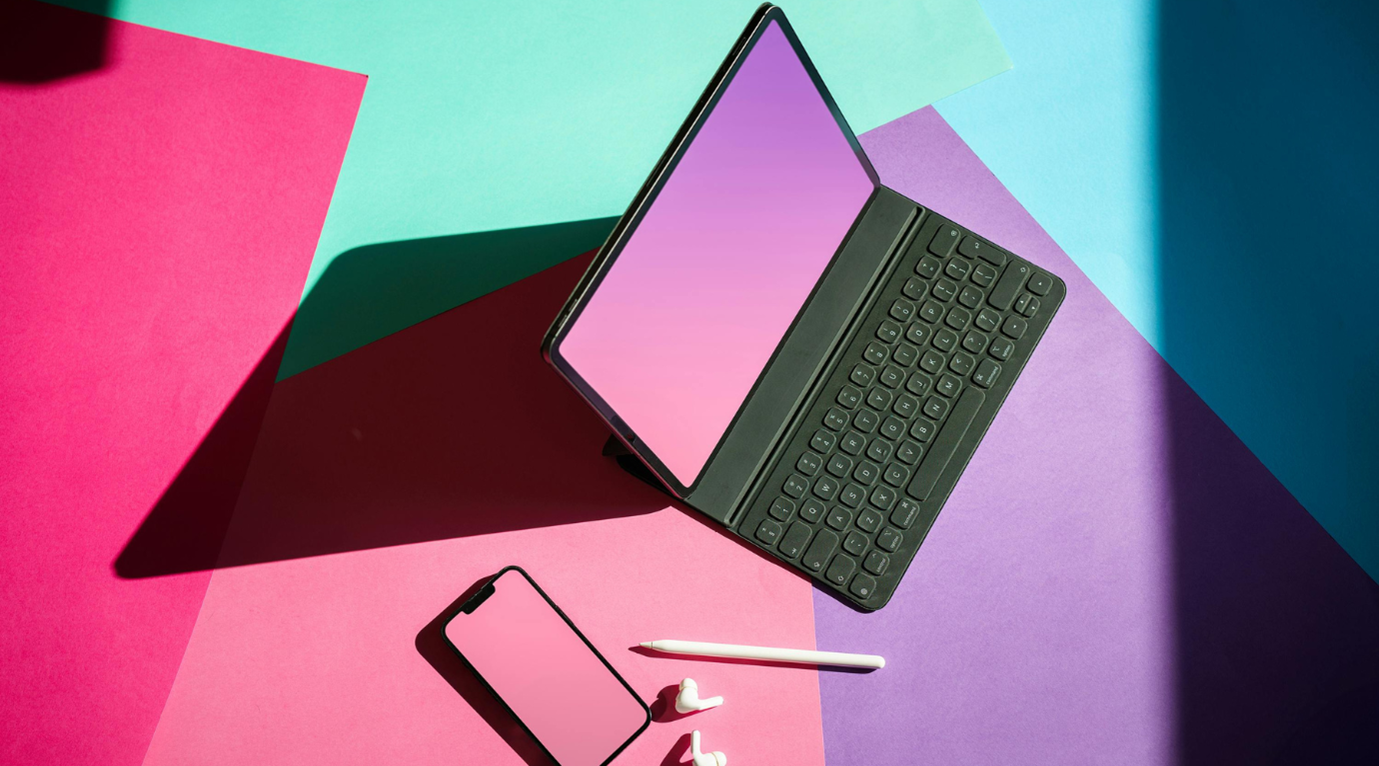
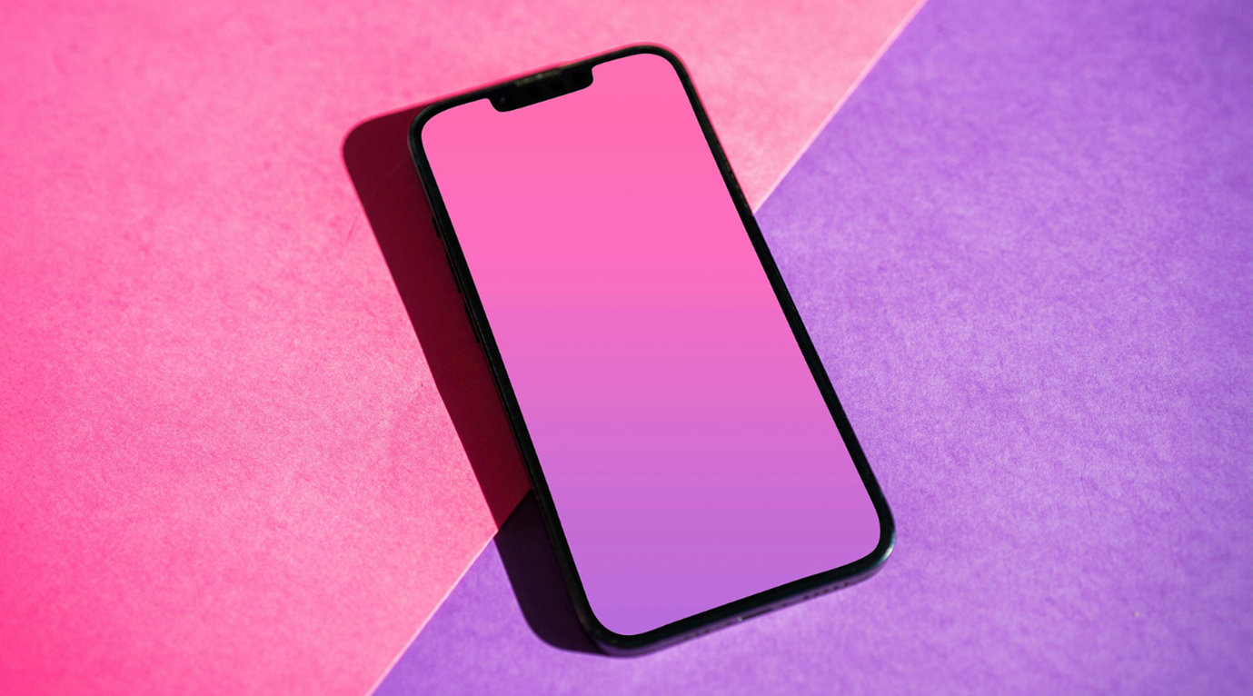
Muted colors are tones that have been softened by reducing their saturation. This can be achieved by adding gray, white, or a complementary color to a base hue. Unlike vivid or neon shades, muted colors such as sage green, dusty rose, and soft cream color muted shades exude subtlety and sophistication. Think of them as a whisper compared to the shout of brighter colors- less overpowering, yet far more impactful when used thoughtfully.
How Muted Colors Are Created
Creating muted colors involves blending techniques that soften their vibrancy. Here are a few methods:
- Adding Gray: Incorporating gray into a base hue reduces intensity while maintaining depth.
- Blending with Complementary Colors: Combining opposites on the color wheel (e.g., blue and orange) creates a desaturated effect.
- Using Tints and Shades: Adding white or black adjusts the brightness and darkness, producing pastel-like muted tones.
- Neutral Overlays: Applying neutral tones like beige or ivory enhances muted effects, such as creating the perfect soft cream color muted shade.
By using these methods, designers can craft palettes that are soothing, elegant, and tailored to specific projects.
The Psychology of Muted Colors
Emotional Impact
Muted colors carry a unique psychological weight. While vibrant colors like red evoke excitement, muted tones calm the senses. For instance, sage green, pale blue, or a soft cream color muted shade can evoke feelings of relaxation and trust; qualities essential in wellness, education, and finance industries.
Focus and Engagement
Muted palettes naturally draw attention to other design elements, allowing text, buttons, and images to take center stage. This aligns with the principles of data design, where muted backdrops are used to highlight intricate visualizations and actionable insights without overwhelming the viewer.
Nostalgia and Timelessness
Muted colors often evoke a sense of nostalgia, making them an excellent choice for brands aiming to tell authentic and emotionally resonant stories. Vintage-inspired hues, like dusty rose or faded lavender, resonate deeply with audiences and can enhance user engagement when paired with effective UX audits.
Embody Subtle Elegance for Bold Impact
Discover how muted tones enhance user experiences and create timeless designs with Neuro Interactive.
Get StartedWhy Muted Colors Are Dominating Modern Design
Muted colors have become a staple in digital and web design due to their adaptability and functional benefits. Let’s explore the reasons behind their growing popularity.
1. Reducing Eye Strain
The prevalence of digital screens has made visual comfort a priority. Bright colors can cause fatigue over time, whereas muted tones – such as soft grays or soft cream color muted shades are gentle on the eyes. This makes them ideal for user interfaces (UI) designed for prolonged engagement, such as meditation apps or e-learning platforms.
2. Enhancing Usability
Muted palettes improve usability by reducing distractions and creating a cohesive visual experience. For example, service design frameworks often use muted tones to guide users seamlessly through complex processes, ensuring both clarity and satisfaction.
3. Supporting Brand Identity
Brands across industries are leveraging muted colors to communicate sophistication and authenticity. Whether it’s a wellness platform using sage green or a tech startup opting for muted teal, these tones reinforce trust and professionalism. Companies that specialize in agile frameworks for startups frequently use muted colors to balance innovation with approachability.
Applications of Muted Colors in Digital Design
Muted colors have found a permanent place in the digital design toolkit, influencing everything from web layouts to app interfaces. Here’s how they’re making an impact:
1. UI/UX Design
Muted colors play a pivotal role in enhancing user experiences by creating interfaces that are both functional and visually appealing. Features such as enterprise platform experience (EPX) design rely on muted palettes to craft intuitive systems that prioritize user satisfaction.
- Example: A muted beige background paired with navy accents creates an elegant and professional UI for a project management tool.
- Result: Enhanced focus on key functionalities without overwhelming the user.
2. Storytelling and Branding
Muted colors are invaluable in storytelling. They allow brands to craft narratives that are both subtle and memorable. By combining muted tones with tailored UX audits, companies can ensure that their designs align with user preferences and brand values.
3. Highlighting Visual Elements
Muted colors create the perfect backdrop for product showcases. For instance, pairing muted peach tones with white ensures that call-to-action buttons and product images stand out. This approach is often used in UX for enterprises, where large-scale operations require clear focal points in their digital environments.
How Muted Colors Are Integrated into Advanced Design Frameworks
1. Agile Solutions for Startups
Startups require flexibility and speed in their designs. Muted colors, such as soft cream color muted shades, offer a versatile foundation for creating minimalist yet impactful interfaces. Combined with agile frameworks, these palettes adapt seamlessly to evolving brand needs.
2. Service Design and Customer Engagement
Muted colors enhance service design by creating user-friendly journeys that retain customer attention. For example, an e-commerce platform using muted earth tones can guide users from product selection to checkout with ease.
3. Tailored Experiences with EPX Design
Enterprise platform experience design leverages muted palettes to enhance functionality across large-scale systems. Subtle tones reduce cognitive load, ensuring that users can navigate complex platforms efficiently.
Future Trends in Muted Color Design
Muted colors are here to stay, but their applications will continue to evolve. Here’s a glimpse of what the future holds:
1. Muted Gradients
Designers are experimenting with gradients that combine muted tones for depth and dimension. For instance, blending a soft cream color muted shade with muted lavender creates a visually dynamic yet calming effect.
2. Personalization in User Interfaces
Customizable themes that include muted color options are becoming standard. Users can select tones that resonate with their preferences, enhancing engagement and satisfaction.
3. AI-Driven Color Selection
Advanced AI tools are beginning to recommend muted palettes tailored to specific industries, enabling designers to create optimized and impactful designs effortlessly.
Conclusion
Muted colors are more than a design choice; they are a powerful tool for crafting user experiences that resonate emotionally and functionally. From reducing eye strain to enhancing brand narratives, these colors bring balance and elegance to digital design.
For over two decades, Neuro Interactive has championed the integration of muted palettes into digital solutions. By leveraging services like UX for AI, data design, service design, and agile frameworks for startups, they have transformed how brands engage with their audiences through thoughtful and innovative designs.
Are you ready to embrace the timeless charm of muted colors in your projects? Let these hues guide your creative journey, where every shade whispers sophistication and every design tells a story.