Website Design & Development
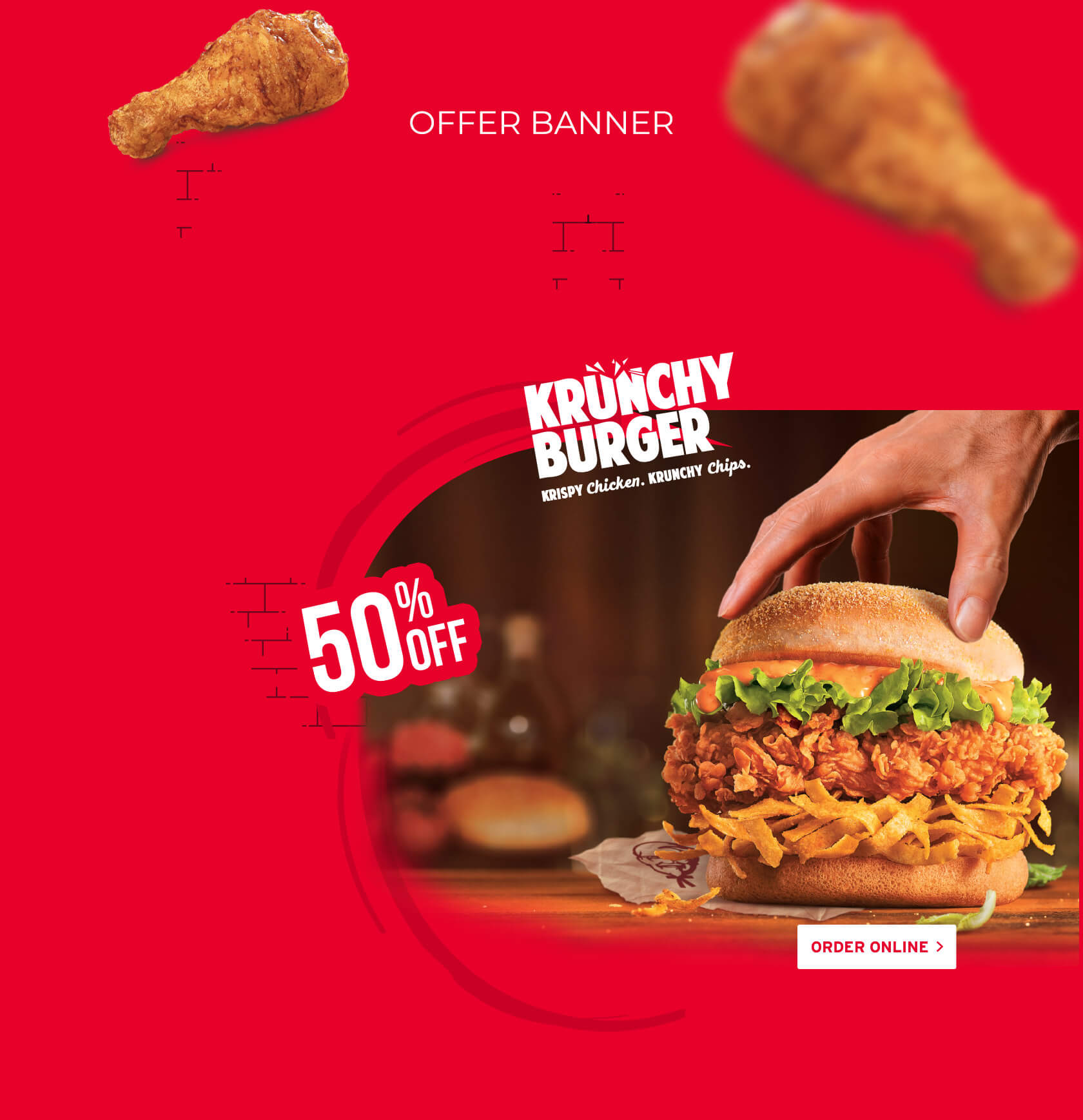
KFC©, a subsidiary of Yum! Brand is the world’s most popular chicken restaurant chain. We designed and developed a brand website, a virtual hangout space for millennials who love to order online.
Our objective was to create the brand's most important asset which would go on to become the mainstay of everything digital for them.
The aim was to be unique and stand out among the digital crowd. We wanted to grab everyone’s attention which means we had to create a distinctive design, which quickly grabs everyone’s attention.
Digital storytelling is what enables us to educate the visitors and when it comes to the KFC brand, a compelling story was a must. Who are they? What are their values? These were the questions we wanted to answer via intelligent content placement.
Working with a global brand changes the whole performance matrix, our target was to deliver a brand website that not only drives the customers to associate with the website, but all this had to be done within the set time frame.
The challenge to create a website that was going to establish the digital identity of the global brand, motivated us to push our limits & discover our span of design & development abilities.
The first step was to discover the key requirements of the brand. Following which our team did in-depth research on touchpoints that delivered positive impacts, which we can later incorporate into the sitemap. The secondary goal of the research was to find elements and modules that can create a unique design experience for the brand, something that could create an equally strong online experience.
Post discovery phase, the focus was to execute the design & development strategies. Our team outlined the optimal architecture of the online asset and refined the functional requirements. Neuronimbus developed the website using Magento Community Edition as the underlying platform. The design team employed the creative and innovative use of high res media throughout the digital platform to deliver the user experience that KFC deserved.
Our Quality Assurance Team rely on thorough testing, this is something they take very seriously. They double-checked every creative and every feature module. They optimized the site performance and made sure that everything is working as it should. They carefully examined the renders on a variety of browsers and mobile devices to ensure a uniform quality experience across devices. Only after which the website was delivered.


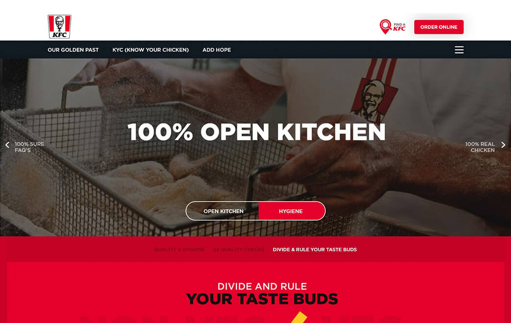
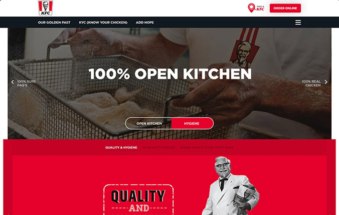
A mobile-friendly brand website that migrated KFC’s offline popularity to the digital space. The imagery is striking against the minimal design and is effortless for visitors to navigate different sections of the website. Modern content elements draw the viewer deeper into the site to explore more about KFC’s history, the story, and several drives initiated by the brand.
Visit KFC Web